Then there were two…

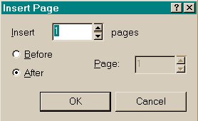
So far you have worked on objects within one page. CorelDRAW has the ability to introduce multiply pages into your one file. When you open a new page, a single page is opened for you, to introduce another one when the need arises you would have to click open the Layout Menu option and choose the first option available Insert Page. You are then presented with the dialog box with the default settings, which you can change according to your needs.
Assuming that you have CorelDRAW open, have a blank page open and insert another page. Change the layout of the pages to Landscape.
Before you go on any further experiment a bit more with the options available concerning multiple pages.
You can also add pages without opening the Layout menu option, at the bottom half of the workspace above the color palette there is an indicator, which shows you how many pages, you are working with. By clicking on the + button you can add more pages, if you find later that you don't really need so many, then open the Layout menu option and click on Delete, a dialog box will confirm your need, after your consideration the page will be removed. The VCR like buttons on the side are handy to move between pages.
Making a Simple Flyer
One of the jobs of a designer is to design, draw and make Flyers, leaflets or brochures. When doing so you have to start with pretty well the basics, what is the company aiming for, what particular message do you want to get across, and remember something vitally important, and that is; do not fill up every available bit of space. In the graphic designers code of behavior is one very special commandment "Thou shall not disregard the use of white space".
You guessed it, you are going to make a brochure for a company. You will be designing a three-fold brochure with printing on both sides announcing an event. You are working for a Communications company, and are announcing the fact to your clients that your company is going global in the coming year. Besides being a service provider in the communications field, your company also produces goods which are used in this industry, such as telephones, cables, sockets and so on. Your company is also very keen on promoting its staff as the key link in being a major player.
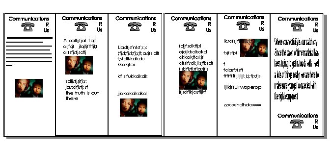
Before you go any further, take a few moments to think of what you should have on your brochure, the opening page message, with pictures and slogans etc. To make you focus it would be advisable to do a rough sketch with paper and pencil. Another thing you have to keep in mind is the fact that is a double sided brochure, with six columns or pieces, so you have to be careful of where you start your first page or your opening page. Have a look at the figure below; it is a rough layout of a brochure. It is decidedly rough at the edges, but it would serve you as a guide of how to start, and visualize your end product.

For your brochure you also have to choose what fold you would have. We would suggest the old trustworthy fold-over, the page is divided into thirds; first, one side is folded over the middle, and then the other side is folded over those. Consider the above brochure. Which one would go where? The last column on the right most side, would be the first look page. The next two on its left side would be the back page and the folded down center page.
The first three columns on the left side of the graphic are the ones, which would be the inside of the brochure. Confused? Don't be. You will have plenty of time to try out the folding possibilities yourself once you have created your own brochure.
The following are broad outlines of how to go about creating the flyer. The instructions are not extensive deliberately, as by this time you should have a fair idea of how to get the basics right. All the help with the tools is explained in the earlier pages.
First you have to create your columns. You would do that by using the rectangle tool and drawing a simple rectangle on the page. Take care of the space, as you have to fit in two more of these. It would be a good idea to have your page setup as Landscape. To make sure you have the right sized rectangles on your page, use the Ctrl-D command to copy the rectangle and then fit it on the page.
Before you start putting in text. Have a think about your company name and logo. A catchy phrase to go with that would be nice as well. You can use the symbols and the Artistic text tool to create your own. Also remember to use one of the tools described earlier to bring the symbol and the company name together. This will make it easier to copy and move around when needed.
Next you will be putting in Text. Take care on this one; remember a long passage of words should probably be styled in Paragraph style. A shorter message could be done with the Artistic tool.
Now for the images, remember to use them sparingly though, as clutter could cause your message to get lost. When using or working with images it is a good idea to keep in mind the size of the image file, as that can relate directly to your working file, and subsequently the memory of the computer you are working on at the moment. You can bring in image files created in other graphic programs. Image file extensions with JPEG, GIF, Bmp, Tiff are some of the examples, which are supported in CorelDRAW. If you still find that you don't have any at the moment, which would do the job, then you could bring in a graphic image from MS Word's Clip Art.
When you have got all your basic contents, you would probably need to move them around to get the best possible effect. Remember that practice makes the deed perfect!
|
Top of the page |
To the previous page |
To the next page |
To the main page |